At present Live Register data are only available at the scale of the 120 or so social welfare offices. These areas, which have no defined boundaries, whilst telling the story of Live Register at a sub-county scale are quite large in size, and mask the complex patterns of claimants on the ground. As any local knows, not all places in an area are equally affected by the recession, with some neighbourhoods being disproportionally hit by job losses. As studies in the UK and elsewhere demonstrate, where data can be mapped at the postcode level, large variations can occur across just a few streets. Such evidence is important because in a time of declining resources for intervention it is more effective to target those resources at areas of most need.
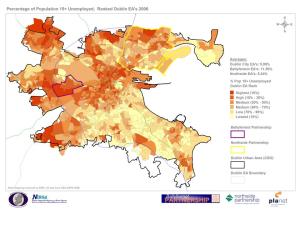
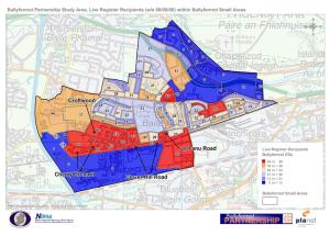
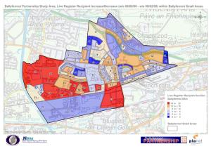
To date, maps of Live Register data are, at best, mapped at the county scale. The three maps below, in contrast, show the unemployment rate ranked by area for Dublin mapped at Enumerator Area scale (c. 330 households) for 2008, and Live Register recipients for August 2008, and change in the number of recipients between August 08 and February 09, at the new Small Area scale (c. 100-120 households) for the Ballyfermot/Chapelizod Partnership Area.
In the first map, the areas that are shaded dark brown are in the top decile for unemployment rate. In the second map, the areas shaded red have the highest numbers of claimants. With respect to the third map, the areas in red are those that have experienced significant increases in Live Register claimants, whereas those in dark blue show places where people up to Feb 09 have so far retained their jobs. In general, what the map shows is that existing areas of high numbers of claimants and the areas immediately surrounding them are those areas gaining the most new claimants and that those areas with low numbers of claimants remain relatively low. In this case, it is in parts of Ballyfermot that claimants have grown, whereas Chapelizod weathers the storm quite well, reflecting the different labour markets that their respective inhabitants are/were employed in.
The study was undertaken by NIRSA working with Ballyfermot/Chapelizod and Northside Partnerships and the Department of Social and Family Affairs (DSFA) and was published by Dublin City Council earlier in the year. Neighbourhood maps were created for all forms of Live Register claims at the new Small Area scale. These Small Areas, created by the National Centre for Geocomputation for Ordnance Survey Ireland, will form the micro-geography for the 2011 census.
At present the research remains a one-off pilot study, but it does highlight two things: 1) the geography of unemployment, and the recession in general, is highly uneven and is not affecting all areas equally; 2) that the evidence base for making key policy decisions would be significantly enhanced by these kinds of data.
Justin Gleeson and Rob Kitchin


December 31, 2009 at 10:48 am
[…] is playing out across the state at local and regional scales (for example, with respect to the live register, public sector pay, house prices and office rents, residential vacancy rates, cross-border […]
January 8, 2010 at 10:33 pm
see http://www.ultantechnologies.com/news/2010/01/using-dynamic-maps-to-display-your.html for a dynamic map showing the number of people signing on in each county as a percentage of that county’s estimated population between 2005 and 2009.
March 3, 2010 at 9:48 am
[…] What the animated map shows is that Live Register recipients fluctuated up and down for most of 2006, but from the start of 2007 started to increase rapidly, first in the south west before spreading nationally. From the beginning of 2008 the first areas reached a 150% increase from the Q3 2006 figures, quickly followed by increases of 250% above the Q3 2006 figures in the south west, and increases of 200 to 250% in the commuter belts around the cities. By the end of 2009, most of the country was above the +150% rate with only a few peripheral areas such as parts of Waterford and the Atlantic fringe under that rate. As the Live Register figures continue to increase, those areas in red are likely to shift to purple and turquoise. For our post on the microgeographies of the Live Register click here. […]
March 4, 2010 at 12:47 pm
T his is truly great work and thank you for such dedication to the cause of the ordinary citizen
March 4, 2010 at 7:07 pm
Good work. I hope this gets wider coverage.
June 21, 2016 at 3:21 pm
[…] [update on 8th Jan: Thanks to Matthew Sammon for the link to this description of the live register numbers]. […]